

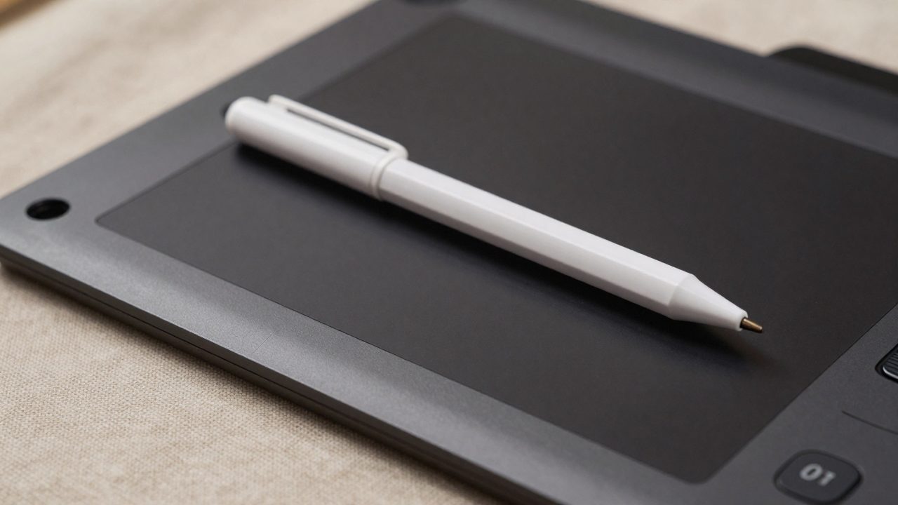
Procreate’s pressure curve controls how hard you press with your Apple Pencil versus how strongly that pressure affects a brush — line width, opacity, or whatever the brush’s pressure setting is tied to. There’s no single “best” curve for everyone, because the right shape depends on how hard you naturally press and what kind of mark-making you’re doing, but there are well-established starting points for common problems.
Where to find it
Procreate has two separate places to adjust pressure response, and it’s easy to confuse them:
- Global Pencil settings — tap the wrench-shaped Actions button, go to the Prefs tab, and choose Edit Pressure Curve. This affects every brush that uses the default pressure behavior.
- Per-brush settings (Brush Studio) — tap your current tool (Paint/Smudge/Erase) to open the brush library, tap a brush a second time to open Brush Studio, then open the Apple Pencil tab. Each brush can have its own independent pressure curve here, which overrides the global one for that brush specifically.
The graph itself works the same way in both places: the X axis is how hard you’re physically pressing, from none (far left) to maximum (far right); the Y axis is the resulting effect on the brush, from none (bottom) to full strength (top). By default it’s a straight 45-degree line — effect scales linearly with pressure. You can add up to four extra nodes and drag them to reshape the curve.
Common problems and the curve shape that fixes them
“I have to press really hard to get a visible line.” This is the single most common pressure-curve complaint, and the fix is to steepen the very start of the curve — drag the lower-left portion of the line upward so even light pressure produces a noticeably stronger effect. You don’t need to touch the rest of the curve; the first segment matters most.
“My lines are too sensitive — small pressure changes cause big width jumps.” The opposite problem calls for the opposite fix: flatten the early part of the curve so light-to-medium pressure stays fairly consistent, then let it ramp up more steeply only near maximum pressure. This gives you a wider “safe zone” for consistent line weight during inking.
“I want a classic tapered, calligraphic stroke.” A smooth S-curve — flatter at both ends, steeper through the middle — tends to produce the most natural-feeling taper for lettering and line art, since it mirrors how pressure actually builds and releases during a stroke.
“Painting/blending feels too abrupt between light and heavy pressure.” For soft, blendable brushes used in painting rather than linework, a gentler overall slope (closer to flat, rising only gradually) tends to feel more forgiving and less “on/off.”
Practical setup advice
- Adjust the curve per-brush rather than globally if you use very different brushes for inking versus painting — a curve tuned for a fine inking brush usually feels wrong on a soft round paint brush.
- Change one thing at a time. The first segment of the curve (light-pressure response) has the biggest practical impact for most people’s complaints — adjust that first before reshaping the whole curve.
- Test on an actual stroke, not just by eye on the graph. Draw a few lines at your natural range of pressure after each adjustment; the curve that looks reasonable on the graph doesn’t always feel right on the canvas.
- If you frequently switch between an Apple Pencil 1 and 2 or between iPads, note that pressure sensitivity hardware differs slightly across generations — a curve tuned on one device may need a small tweak on another.